Background
When I launched Ugmonk in 2008, I was fresh out of college and still relatively new to the world of design. I had been doing all sorts of art my entire life, but it wasn’t until college that I immersed myself in graphic design.I didn’t have a ton of experience designing logos, and I actually still consider them one of the hardest things to design.Logos need to be so many things in such a small package: simple, unique, memorable, and versatile in all sizes.They also need to instantly communicate the entire vibe of a brand, which is no small feat.

Original Process & Logo Concepts
To be honest, the name “Ugmonk” and the original logo were almost an afterthought. Don’t get me wrong—I put some thought and time into designing the original logo, but I wasn’t thinking of it from a strategic branding or long-term standpoint. At the time, Ugmonk was merely a passion project, nothing more. When I designed the original logo, I was more interested in making something that looked cool and unique than in creating a proper logo that reflected an enduring mission and set of values. Case in point? I recently dug up the other early concepts that I designed alongside the eventual winner—and boy, am I glad I didn’t go with any of these other options! Embarrassingly bad. They look so dated and rushed, and more like a student project than the carefully considered brand I knew I wanted Ugmonk to be. As Ugmonk matured into a “real” brand, the logo seemed to fit less and less with our reputation. As a refined lifestyle brand, we were creating products with clean lines and a minimalist aesthetic, while our logo was heavy and too quirky. Still, I felt nervous about redesigning it since it had become so recognizable and carried so much equity.
Whenever I asked friends and customers for feedback about ways to improve Ugmonk, redesigning the logo was something that came up over and over as something to consider. That trend, combined with my own gut feeling, meant that redesigning the logo was always a matter of when.
As Ugmonk matured into a “real” brand, the logo seemed to fit less and less with our reputation. As a refined lifestyle brand, we were creating products with clean lines and a minimalist aesthetic, while our logo was heavy and too quirky. Still, I felt nervous about redesigning it since it had become so recognizable and carried so much equity.
Whenever I asked friends and customers for feedback about ways to improve Ugmonk, redesigning the logo was something that came up over and over as something to consider. That trend, combined with my own gut feeling, meant that redesigning the logo was always a matter of when.
Early Exploration and Updates
Last year, I experimented with some logo updates on and off, but was having trouble making any real progress. In those early explorations, I tried to combine the iconic Ugmonk ampersand with the wordmark. But the curvy form of the Ugmonk ampersand just didn’t pair well with the clean minimalist type, and it felt a bit forced and contrived.
 The Ugmonk ampersand will still remain a core part of the brand, but I decided it didn’t need to be incorporated into the actual logo.
It was only after this aimless experimentation phase that I realized I couldn’t approach a logo redesign the same way I’d approached it the first time. If we were a “real” brand now, we needed to start the process officially, with a creative brief (or, in non-designer terms, a concise document that clearly outlines the objectives for the project).
Yes, it felt strange to write a brief as both the designer and the client, but the process forced me to define my goals, and it proved extremely helpful.
Here’s my creative brief that I put together:
The Ugmonk ampersand will still remain a core part of the brand, but I decided it didn’t need to be incorporated into the actual logo.
It was only after this aimless experimentation phase that I realized I couldn’t approach a logo redesign the same way I’d approached it the first time. If we were a “real” brand now, we needed to start the process officially, with a creative brief (or, in non-designer terms, a concise document that clearly outlines the objectives for the project).
Yes, it felt strange to write a brief as both the designer and the client, but the process forced me to define my goals, and it proved extremely helpful.
Here’s my creative brief that I put together:

Further Design Refinement
Now that I had clearer direction, I was able to hone in on what direction to push things. During this stage, I also gathered feedback from friends and other designers to get second opinions on my work. After staring at this for so long, it’s easy to lose focus or start second guessing everything. Here are some of the concepts I landed on:
 Ultimately, any of these options could have worked based on style alone, but most felt too generic, were lacking in character, or were trying too hard.
Ugmonk isn’t just another luxury brand. We are different. We are small, personal, design-centric, and transparent. I wanted to make sure the new logo encapsulated that.
Ultimately, any of these options could have worked based on style alone, but most felt too generic, were lacking in character, or were trying too hard.
Ugmonk isn’t just another luxury brand. We are different. We are small, personal, design-centric, and transparent. I wanted to make sure the new logo encapsulated that.
The New Wordmark
The New Icon
To accompany the wordmark, I also designed an icon to use in smaller applications or in places where the wordmark doesn’t make sense (as an avatar or on tags, for example). We didn’t have an icon at all before, so this was a fun step.
In Motion
Though most applications of our logo will be used as a static image, there are some fun opportunities (such as this video) to set the logo in motion and create something even more dynamic. I reached out to my friend Seth Eckert who is a animation wizard and he worked his magic to create this super slick animation.Brand Style Guide
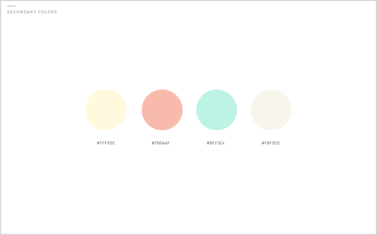
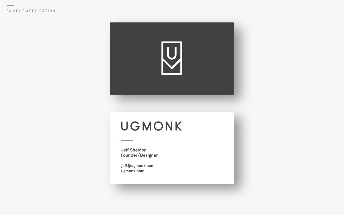
As part of the larger brand refresh, I also put a lot of thought into creating an in-depth style guide to define the new Ugmonk. Designing a logo is only part of how a brand’s style is communicated. Choosing colors, typefaces, and applications of how individual elements will be used brings a consistent vibe to each medium. Though this guide is not all inclusive, it creates a strong foundation to work from and reference as I design all of the creative in the future.Here’s a look at our new style guide:


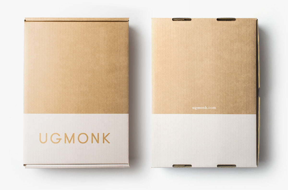
Custom Packaging
I'll be writing more in a future post about how I designed and produced all of our new custom packaging. It's been really fun to see this all come to life in these tangible mediums.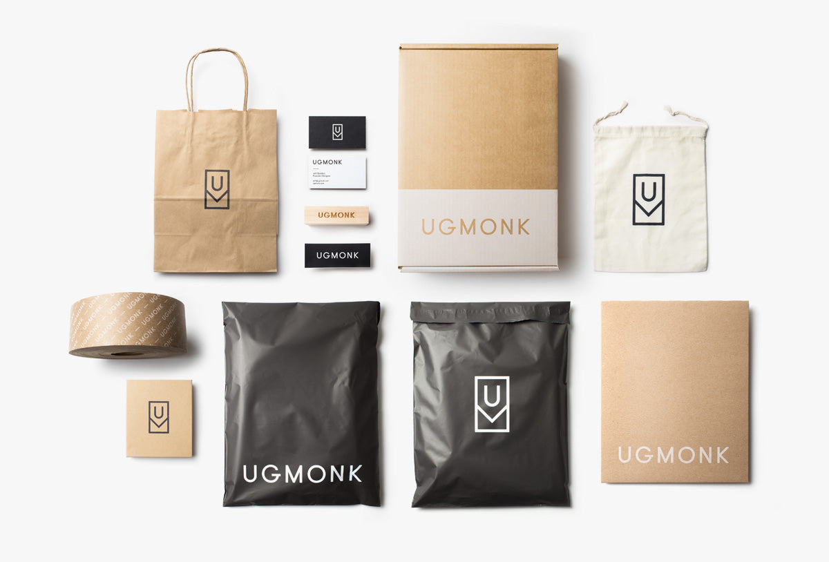


So, that’s where we’re at now with Ugmonk 2.0. A lot has changed, and we’re so excited about it, but one thing that hasn’t changed is our commitment to creating quality products that tell a story. Hope you enjoyed this inside peek at my design process and some of the thought that went into this major brand update. It feels great to have a new logo that embodies and reflects what Ugmonk is all about. Have a question about my design process or the new logo? Leave a comment below or tweet at me here.

