Why Redesign?
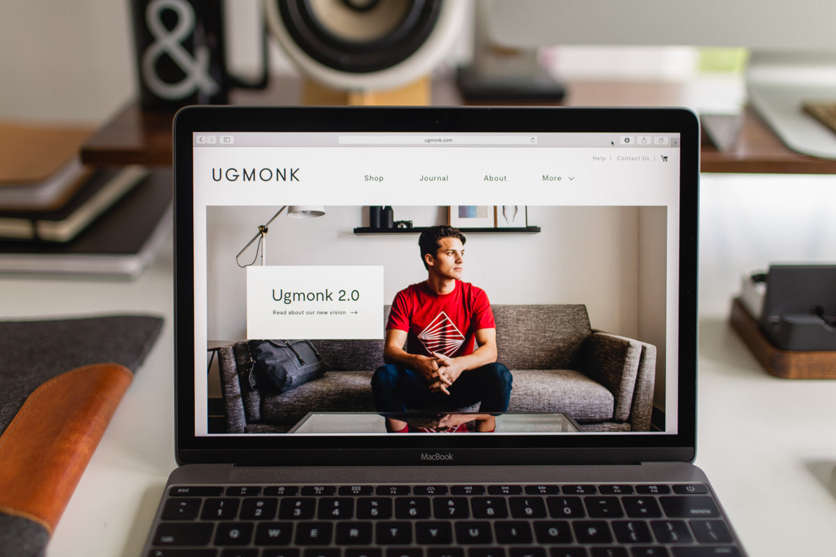
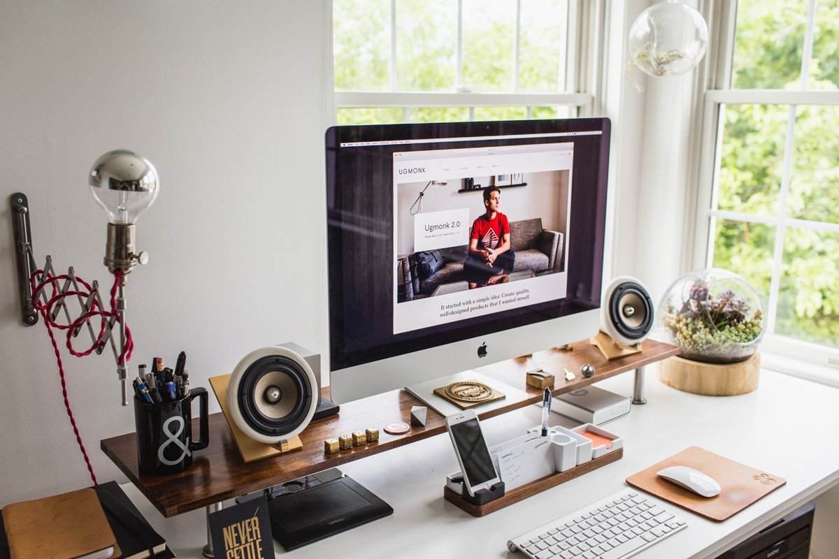
When I mentioned that we were redesigning our whole site, the response I heard from several people was, “Why redesign your site? It’s already so nice!” I appreciated that, but I knew it could be better. I don’t like to settle for anything less than perfect (yes, I know we are technically not perfect, but I strive to do everything with excellence). The idea to redesign our site started with wanting to update a few things here and there like the home page layout and product photo viewer. But the more I thought about it, the more it made sense to do a complete site overhaul. Our current iteration of the site has served us well for three years, but the web moves fast, and we were due for a major update. During this time, we also started talking seriously about the whole Ugmonk brand redesign and what that could look like. The 2.0 redesign was deeper than a simple visual update.It was about realigning our vision to better focus on our strengths, like being transparent and sharing our journey.The combination of the rebrand and new vision played right into the desire and strategy to redesign our site. Though the new site may appear like a small update, it's actually a huge step forward for us. I want to walk you through the thinking that went into it and the tools we used to pull it all off.
Here's a little .gif to show the evolution of our site since 2008:

The Goals
1. Prioritize storytelling to better highlight the new Journal content
Why? Ugmonk is more than just a t-shirt brand. The stories behind the designs and the way I create our products are a huge part of what makes Ugmonk unique. I wanted to create a better home for this content and make it easier for readers to discover these stories.2. Enhance the shopping experience with better filtering and discoverability
Why? Our product collection has expanded quite a bit over the years. Rather than just showing all products on a single page, I wanted to make it easier for you to find specific products, related items, and alternate colors.3. Strip out all distracting elements to better focus on the product and content
Why? Over the years, we’ve added extra little details to different parts of our site, but many of these ended up being a distraction from what really matters: the products and content. The new Journal section has a more editorial feel and makes it easier to sit back and enjoy longer content. My goal is for the new site to feel lighter with more white space and breathing room.
Why not just use an existing template or theme?
It would have been much easier to just find a Shopify or Wordpress template that we liked and purchase a license for a couple hundred dollars. But we didn't want to be confined by the limitations of existing templates or spend a ton of time (and endless headaches) trying to retrofit them.The goal is to point the spotlight on our products and content, not the web design itself.We want our site to be a unique experience that instantly communicates what Ugmonk is all about. The goal is to point the spotlight on our products and content, not the web design itself. Building it from the ground up allowed us to custom tailor each part of the site without having to compromise or settle for things that didn't work the way we envisioned.

The Details
There are hundreds of little details that went into designing and building each part of our new site. I won't touch on every one of them, but here's an overview to highlight the main improvements and new features.Updated Visual Aesthetic
- New logo, fonts, and visual language to match our new branding
- New home page (separate from the main shop page) to introduce people to the Ugmonk brand. Better integration of content and commerce.
- Added to the overall functionality, while simplifying the browsing experience. We removed extra visual clutter like sidebars to put the focus on our content and products.

New Pages
- Home page – brand new page to better introduce people to the Ugmonk brand.
- About page – updated to better tell our story and incorporate where we’ve evolved to
- Journal – new streamlined blog design to better share content and photos
- Product page – redesigned to make it easier to quickly view photos, product details, and related colors
- Collection page – new product filtering and size availability
- Size & Fit – more detail about each type of product, material, and fit
- FAQ – redesigned and updated to make it easier to find answers
- Email Sign Up – better designed subscribe page
- Lookbook – updated functionality
- Resource page – a list of all the apps, services, and design tools I use
- Video page – a place to watch all of our videos
- Download page – to give away free photos and other downloads
- Charity page – redesigned and new ongoing charity partnership
- Contact page – redesigned to match updated aesthetic
- Cart & Checkout – slide-out cart for smoother checkout experience
- 404 - fun little easter egg :)
Better optimized for mobile and touch screens

Product filtering to help you easily find products with a specific size, material, or color

Scrolling product photos to make it easier to quickly view all photos

New slide-out cart for smoother checkout experience

The Tools
There are so many technical things happening behind the scenes to make our site work, but I'll save those details another post. Here's a look at the main tools we used to build everything.Shopify
We’ve been using Shopify to power the shop portion of our site for several years now and love it. In our opinion, it's the best hosted ecommerce platform available. Using an all-in-one hosted platform like Shopify allows us to spend more time focussing on designing products and building our business rather than trying to code and develop our own custom ecommerce platform. We can rely on Shopify to handle whatever traffic we throw at it, even on our busiest days when we’re releasing new products. The Shopify team has rolled out many improvements and new features in the last couple years, and the platform just keeps getting better. If you’re serious about setting up your own online shop, Shopify is the way to go.While Shopify excels at ecommerce, it falls short on the content management side.
Wordpress
All of the non-shop portions of our site run on an installation of Wordpress hosted separately. We developed a custom theme from scratch that is tailored to our new branding and design. Why we didn't build our entire site on Shopify? While Shopify excels at all things ecommerce, it falls short on the content management and blogging side of things. That's where Wordpress comes in. Though it can have its quirks, we like Wordpress for its flexibility and customizable backend that makes it easy to manage and update our site. There are plenty of other blogging platforms out there, but Wordpress still remains one of the best CMS options available.Custom Wordpress modules
With the new site design, we wanted to make it easier to update all parts of the site without having to hard code everything. To accomplish this, our developer built custom modules in Wordpress with predefined styles and functionality. Now we can easily add, remove, or reorganize different sections on each page without having to touch a line of code. This is a massive time saver.Fused
Web hosting is one of those things you want to set and forget. You usually only think about it when it’s not working. Unfortunately, many hosting companies (even many of the big-name ones) fall short on both customer service and the actual speed and up time. Thankfully our experience with Fused has been the opposite. We’ve been using Fused for 7+ years, and everything from their personal customer service to the reliability of hosting has been awesome.
The Manpower
One of our unique strengths is that in addition to being the CEO of Ugmonk, I'm a designer by trade and have been designing for over 10 years. I'm able to design everything in-house which saves us a ton of money and allows us to work super lean. Our entire site was built by two people, me and our developer. This setup works really well for us, but if you don't have a strong design background I don't recommend trying to do it all yourself just to save money.Our entire site was built by only two people.
Design
As the design perfectionist that I am, I wanted to personally design the new visual language for the new site and bring a consistency to everything. Though I don’t design websites every day, I have a good feel for UI and UX and know what I personally like as a user. I took a lot of cues from other sites that I enjoy while still creating a unique experience that I hope enhances what Ugmonk’s mission and brand is all about. I know it’s old school, but I actually created all of the design comps in Photoshop, since that’s what I’m most proficient in. It was fun to see how our new branding and aesthetic drove a lot of the design direction for our new site. It's important for design to feel seamless across both print and digital mediums.Development
Up until this point, we’ve done all of our development in-house (my brother is a professional developer). But with our busy schedules and lots going on, we decided to work with an outside developer who could fully dedicate his time to the site build. We hired Jacob Fentress, who is a wizard at both Shopify and Wordpress development and was incredible to work with. I can't recommend him enough! It was fun to work with him to execute the technical side of things, but also to work through the UX and problem solving to make the site work the way we wanted. Jacob went above and beyond what we even knew was possible and built a foundation that allows us a ton of flexibility to make updates to our site quickly and easily.


