The New Logo
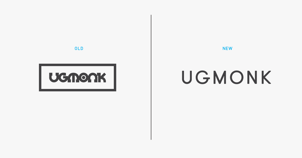
A logo carries weight and equity. We all associate our favorite logos with certain feelings and values. Making a change can be hard, and it should not be done hastily. The original Ugmonk logo has held up well over the past 7 years, but as we have evolved from a few T-shirts to a much bigger lifestyle brand, the logo has started to feel out of place. So, over the last year, I’ve been playing and experimenting with an update. Our new logo reflects Ugmonk’s high-quality and minimalist aesthetic, and still reflects the quirkiness and personality that separates us. It’s light, breathable, and simply geometric—just like everything we make. Read about my design process of how I landed on the final new logo. This was over a year in the making and I'm really proud of the finished product!
The New Packaging
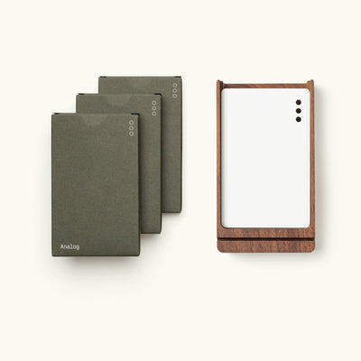
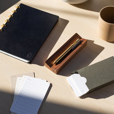
We're also introducing brand new custom packaging. Soon I'll also be sharing more details about how I designed and sourced all of our new packaging materials. Sign up here to be notified when that post goes live.


The New Website
Along with the logo, we’re launching a full redesign of our website. While the new Ugmonk.com may not look like a drastic visual departure, it's a massive step forward to deliver an even better experience. We rebuilt and redesigned the entire site from the ground up.Our goal was to make your experience on our site reflect the premium products we offer.We stripped out all unnecessary elements, cleaned up some loose ends, and added lots of new functionality to make it even easier to shop and engage with our content. I'll be sharing more of the technical details about how we pulled off this redesign in the coming weeks.
What’s New:
- Home page – brand new page to better introduce people to the Ugmonk brand.
- About page – updated to better tell our story and incorporate where we’ve evolved to
- Journal – new streamlined blog design to better share content and photos
- Product page – redesigned to make it easier to quickly view photos, product details, and related colors
- Collection page – new product filtering and size availability
- Size & Fit – more detail about each type of product, material, and fit
- FAQ – redesigned and updated to make it easier to find answers
- Email Sign Up – better designed subscribe page
- Lookbook – updated functionality
- Resource page – a list of all the apps, services, and design tools I use
- Video page – a place to watch all of our videos
- Download page – to give away free photos and other downloads
- Charity page – redesigned and new ongoing charity partnership
- Contact page – redesigned to match updated aesthetic
- Cart & Checkout – slide-out cart for smoother checkout experience
- 404 - fun little easter egg :)

Introducing...The Ugmonk Journal
Ugmonk has always been personal and transparent. These are qualities I appreciate as a consumer, and I insist on them as a business owner. Each product is a peek into my head, and sharing the stories behind them has always been as important as the products themselves. It’s been awesome to connect directly with you and to build the brand slowly through those stories, one person at a time. Most companies are focused on either selling great products or putting out great content. It’s hard to do both well, but the new Ugmonk Journal is my commitment to doing just that.I want to give you an even deeper look behind the scenes. I want to share everything I know.I run Ugmonk differently than most people run their businesses. I’m not an expert at everything, but I hope you can learn from my successes and failures, and that you can apply them to your own work. Remember that time we went to Honduras? Launched the perfect messenger bag? Got overwhelmed by a “successful” Kickstarter? I want to share more stories like these—more and better. I also want to share more about my favorite tools, apps, and services, as well as other things that I find interesting and inspiring.
Subscribe to the new Ugmonk Journal
Coming up in the next few months, for subscribers to the Ugmonk Journal:
- How I brainstorm and come up with new ideas
- An in-depth look at the Ugmonk rebrand process
- Links to my favorite products and brands
- The tools and services I use to run Ugmonk

New Ongoing Charity Partnership
Each year we do a special Ugmonk Gives Back Charity Drive around the holidays with Rice Bowls to feed needy kids around the world. It's been awesome to rally our customers around this great cause, and to date we've donated over 40,000 meals! We're passionate about giving back and are now increasing our charity partnership to be year-round.We now donate a meal to needy kids around the world for every product purchased all year round.
To sum up Ugmonk 2.0
- New branding, packaging, and aesthetic to match our evolution as a brand
- New website, built completely from the ground up
- The Ugmonk Journal a free behind-the-scenes look at everything we do
- New year-round Charity Partnership to feed more kids.
- We’re still the same in the most important way:
Our continued commitment to creating high-quality products, bringing new designs to market, and being transparent in everything we do.

Keep moving, always improvingI couldn’t be more excited for this new phase of Ugmonk, and I’m grateful you’re here for the ride! I still have so many new product ideas that we’re preparing to bring to market, and I’m always improving our current product line to be the best it can possibly be. Thanks for being part of my journey and for supporting us as we enter this next big step for the brand!
Jeff Sheldon Founder/Designer
P.S. I'd love to hear your feedback. Drop me a message or tweet at me.


